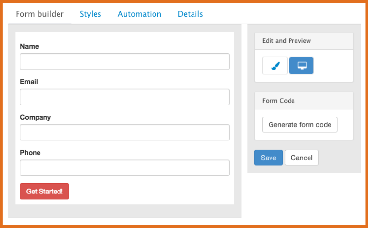
Marketers often overlook the importance of marketing conversion forms when trying to generate leads. They are a utility to funnel contact information into the right list or CRM platform. While they may not be as appealing as landing pages or campaign strategies, form field design plays a vital role in conversion marketing.
Businesses want revenue. Some don’t think that their conversion form’s structure, layout, and labels have that much effect on conversions or sales.
Neither should ignore the psychology and conversion optimization behind the lowly form. It’s better to get this right from the start by using the “best practices” below.
We’ll help you get the most out of your form fields.
Is Your Conversion Form Field Required?
The more fields you ask your users to fill in, the higher the friction. When most or all are required, you add even more friction. Therefore, it’s a good idea to minimize the total number of fields and how many of these are required. You need to find the balance between necessary and “nice to have”.

- Top of Funnel Leads
Someone early in their journey (entering your sales cycle) will be shy to convert, so ask for as little as possible. You want to offer something that has tremendous value to earn their trust. And, you should temper your instincts to bombard them with sales calls or emails right afterward or risk a quick unsubscribe.
Unsubscribe is the ‘left swipe’ of email marketing.
You rarely get a second chance.Paula Pollock - Pollock Marketing Group Tweet
Just because someone has converted doesn’t mean they have moved into the next stage of your funnel. This is why your content and automation rules need to be strategic and optimized over time.
- Middle of Funnel Conversions
Leads can convert from within your list or directly via an ad or CTA on your website. You need to understand that leads in the middle have moved from problem-aware to solution-aware. They need different offers so they will convert.
Just because they are already on your list you can’t become a stalker or offer them less valuable content. Most beginners think, “They are converting a second time. They must be interested, right?”
Actually, this is the trickiest conversion of them all and where businesses get a lot of drop-offs. But, sometimes that’s okay. This is where you need to focus more on converting ideal leads instead of just anyone who’s interested.
Your form can request more pre-qualifying information now. Again, you need to deliver some amazing content that helps them learn more about your solution.
Please do not gate case studies and product sheets thinking this will tell you who is really interested. You need to produce something much better: a webinar recording, ebook, or an analyst report.
Left-Align Form Fields
Align your questions and their corresponding labels on the left. This makes it easier for users to scan the screen quickly. Humans are wired to read and scan presented information in certain ways. Going against this for the sake of design can backfire.
According to some really geeky research by the University of Basel, when you align your text on the left side, above the field box, it reduces users’ time to fill out a form. This natural alignment shortens the time it takes a person’s eyes to travel across the entire form, boosting its readability.
Conversion Form Field for Phone Number?
Phone numbers are a valuable piece of data, but it’s not always necessary to ask for them. Sure, if you need a phone number for an eCommerce order, make it required. But, make it clear why you need it. If there’s no reason to ask for phone numbers, make the field optional.
When a user sees a phone number field and fills it out, they are assuming you will call them. This is a great buying signal. Be sure to have a process in place for calling. Make sure it’s well-timed and not an annoyance.
Be careful to not lose a conversion. You can lose up to 1/3 of potential sign-ups when asking for a phone number.
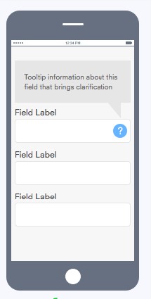
Use ToolTips With Conversion Form Fields
Combat any skepticism that users may have about filling in their data with tooltips. These are popup explanations when you hover over a question or click the little ‘?’.
- Receive weekly updates on new products and promotions.
- We will never share your information with a third party.
- By checking this box, you agree to allow us to contact you to discuss our products and services.
These boxes are great because they allow users to see the exact purpose for each field, so they can decide whether it’s important for them. Stating what will happen in advance actually reduces friction. This also makes users more confident about giving out their information.
Leverage Auto-Fill Browsers
Auto-fill can help increase your conversions because it populates user information based on what they save in their browser.

Adding this capability to your digital forms might be included in your builder. Otherwise, you can add with a little html code. The only issue is whether the data you want from users exists in their browser’s memory. E.g. They may use their personal email address in their browser settings. If you want their business email, odds are you’ll get the wrong one.
Design Mobile-Friendly Conversion Forms
Mobile-friendly designs are important to boost, if not guarantee, higher response rates. To optimize your forms for mobile devices:
- Use smaller field boxes and larger text that’s easy to read
- Break up long blocks of texts into bulleted points
- Format the form using mobile form tools
- Test on multiple devices before publishing
Just because your platform says it’s “mobile-friendly” or responsive, designers can overwrite built-in code with their designs.
Your To Do List
Test your form’s design, data flow, and acceptance with your targets. Metrics aren’t always crystal clear. You may need to hypothesize which elements need improvement.
E.g. Many landing page views, but no conversions = poor messaging, poor offer, high friction form. Looks like a multivariate test is needed.
- Current version = Constant
- Test 1 = Change message, leave all else the same
- Test 2 = Change offer, leave all else the same
- Test 3 = Change form, leave all else the same
You should serve these 4 landing pages up randomly until you get a large enough sample to make a decision on which is the best performer.
Don’t ignore the importance of optimizing your conversion form fields.
These are only some of the most used best practices. If you don’t have the conversion marketing team you need to perform this level of conversion rate optimization – CRO – reach out to us to discuss how we can help.